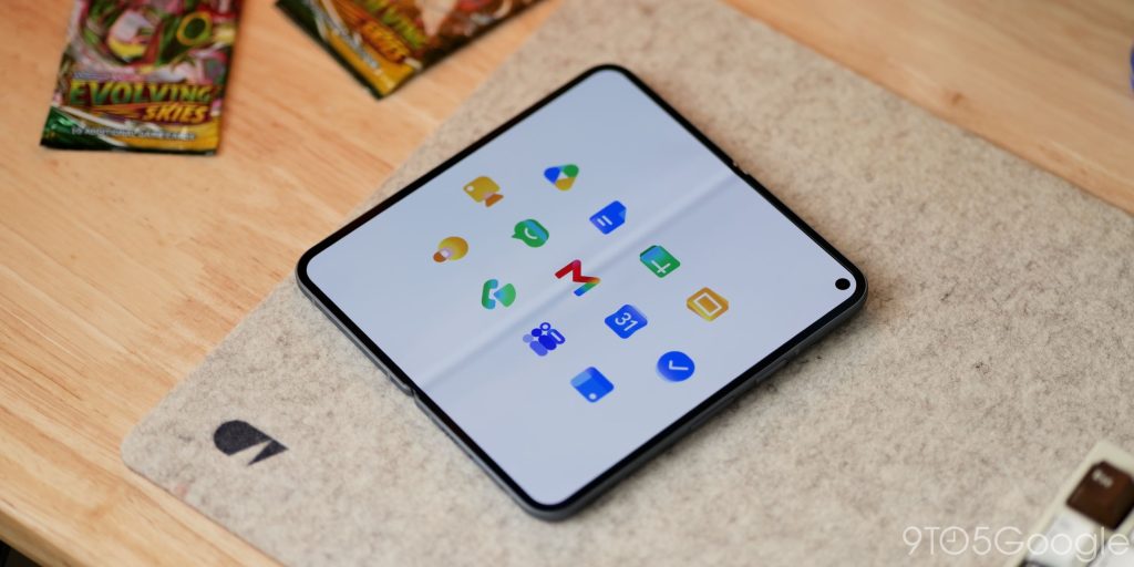
Google’s new gradient icons for Gmail, Calendar, Drive, and other apps are radical redesigns
TL;DR AI
2 min readKey summary
Google is rolling out a major redesign of Workspace app icons, moving away from the old four-color, container-heavy look.
The new icons use gradients, simpler shapes, and more app-specific colors to make Gmail, Calendar, Drive, Meet, Chat, and other apps easier to tell apart.
Apps including Tasks, Keep, Voice, Forms, and Sites are also being updated as part of the wider visual refresh.
The change points to a broader Google branding shift toward an AI-era design language while improving app recognition.
Same topic