Google on why it redesigned the Gmail and Workspace icons
TL;DR AI
2 min readKey summary
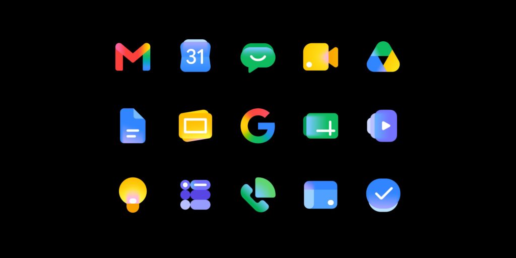
Google is rolling out redesigned Gmail and Workspace icons with a sleeker, more consistent look across its app suite.
The update drops some older container shapes and no longer requires every icon to use all four Google colors.
Google says the visual refresh is about branding, not functionality, so apps should work the same for users and admins.
The new icons will phase into major Workspace apps over the next several weeks as Google aligns the suite with its Gemini-era AI push.
Same topic