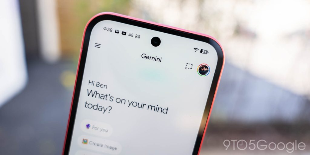
Google has ever so slightly tweaked the Gemini app icon with more color
TL;DR AI
2 min readKey summary
Google is rolling out a subtle Gemini app icon refresh ahead of I/O 2026.
The spark shape stays the same, but the blue area is smaller and red, yellow, and green are more prominent.
The new look reduces the gradient effect and gives the icon a slightly brighter, cleaner feel.
It’s appearing in an Android homescreen shortcut and is already visible on iOS and macOS, but rollout is limited.
Same topic